Art Lesson Vol. 1: Color Theory
A deep dive on color and how to craft the perfect color palette

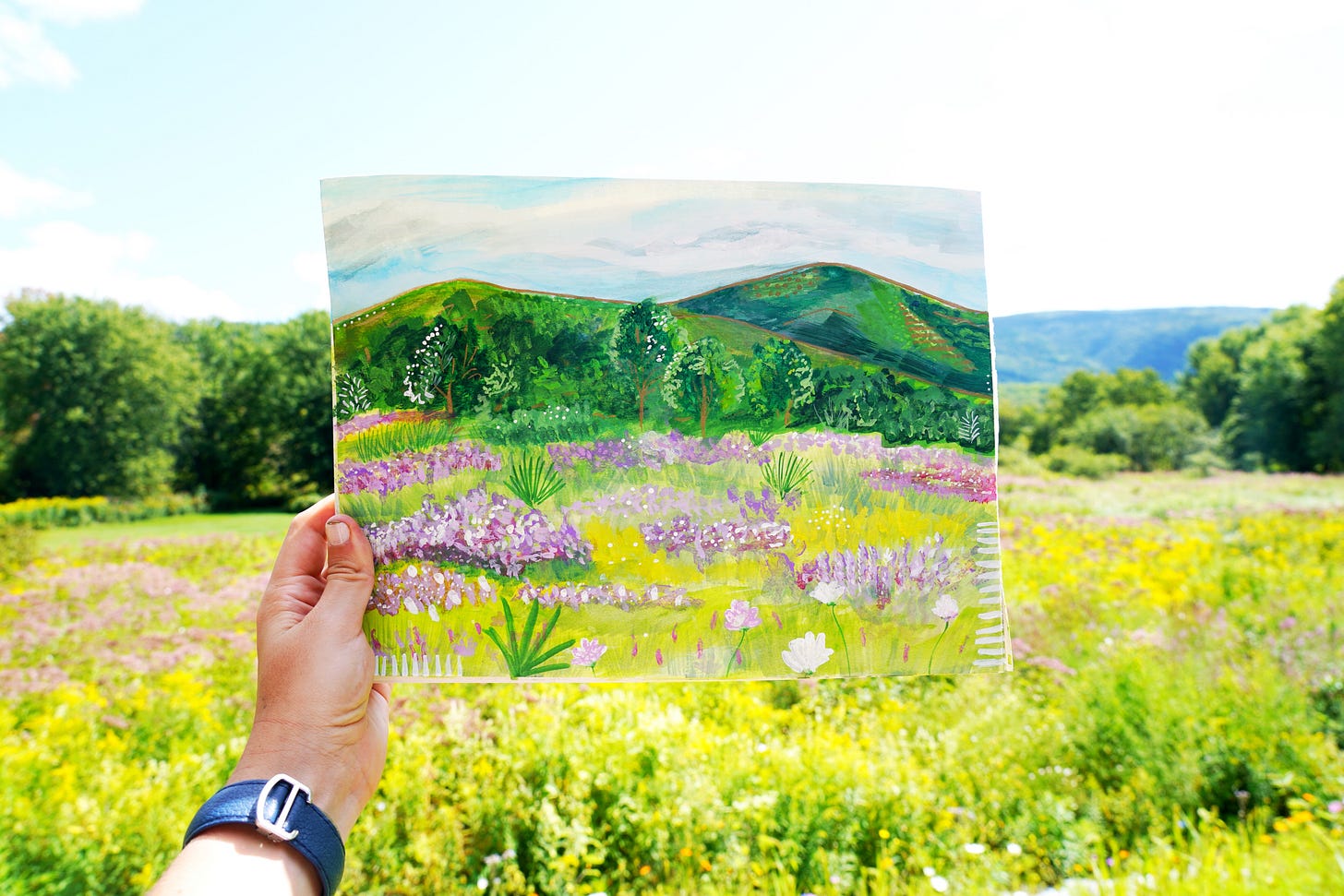
Color is a fascinating and powerful force that appears all around us, but exists in our minds. It can evoke deep emotions and shape our experiences. From the soft, soothing hues of a sunrise to the bold, vibrant shades of a modern art piece, color plays a crucial role in our lives and understanding it a little bit can unlock hurdles in our creativity.
As an artist, I find myself constantly drawn to the study of color theory. It's a never-ending journey of discovery and exploration. I personally love a hands-on approach! I am mostly fascinated by how they can be used to communicate ideas and tell stories.
Color theory can be applied to so many different fields. In the world of art, color is used to create compositions that are visually striking and emotionally resonant. Painters, illustrators, and graphic designers all rely on color theory to guide their creative choices and produce works that are both beautiful and meaningful.
But color theory isn't just important in the arts. It also plays a significant role in fields like marketing and advertising, where color is used to grab attention, convey brand identity, and influence consumer behavior. Studies have shown that certain colors can evoke specific emotions and associations in people, making color a powerful tool for persuasion and communication. We’ll get into that more in a couple of weeks.
In my own art practice, I've found that studying color theory has been incredibly valuable. It's helped me to make more intentional and effective color choices, and the more I learn, the more intuitive it feels.
Looking back at my earlier works, it's interesting to see how my understanding of color has evolved over time. Some of my early color choices were more intuitive and less informed by theory, while others were bold experiments that didn't always work out as planned. But each piece has been a learning experience and has helped me to develop a deeper appreciation for the power and complexity of color.
In the end, I believe that anyone who loves art, design, or visual communication can benefit from studying color theory. It's a fascinating and endlessly rewarding subject that can open up new possibilities for creativity and expression. Whether you're a seasoned artist or just starting out, there's always more to learn and discover about the enchanting world of color.
The post will start with some of the boring stuff, and I will discuss how our brains perceive color in a different post, but below we will discuss some Color Theory 101, how to craft the perfect palette, and how to troubleshoot when you’re stuck!
Enjoy!
x,
Brooke
Origins of Color Theory:
The origins of color theory can be traced back to the late 17th and early 18th centuries. Johann Wolfgang von Goethe and Friedrich Schiller were among the pioneers who articulated this school of thought. Goethe's "Theory of Colours" (1810) was a significant contribution to the field, where he explored the psychological effects of colors and their relationships. Schiller's "Temperamenten Rose" (the rose of temperaments) associated colors with human temperaments, laying the groundwork for color psychology. It is important to note that many of these folks did so through a Western lens.
Key terms:
Below are some basic terms that are the pillars of the color lingo. For examples, when discussing pastels, they are truly “tints!”
Hue: The pure, unadulterated state of a color on the color wheel, without any added white, black, or gray. Examples include red, blue, and yellow.
Value: The lightness or darkness of a color, ranging from pure white to pure black. Adding white to a color creates a tint, while adding black creates a shade.
Saturation: The intensity or purity of a color. A highly saturated color appears vivid and intense, while a desaturated color appears muted and grayish.
Tint: A color created by adding white to a pure hue, making it lighter and less saturated. Pastel colors are examples of tints.
Tone: A color created by adding gray (both white and black) to a pure hue, reducing its saturation and slightly darkening it.
Shade: A color created by adding black to a pure hue, making it darker and less saturated.
Warm and Cool: Colors can be described as warm or cool based on their psychological associations and their relative position on the color wheel. I know it’s confusing, but warm colors can also be described as cool (are you a cool red lipstick person?) and cool colors can also be described as warm, like a warm olive green.
Warm colors: Reds, oranges, and yellows; associated with energy, passion, and heat.
Cool colors: Blues, greens, and purples; associated with calmness, relaxation, and the cold.
Contrast: The difference in luminance or color that makes an object or text distinguishable from its background. High contrast can be created by using colors on opposite sides of the color wheel or by pairing light and dark colors.
Understanding these key terms is helpful for clearly communicating about color and making informed decisions when using color in art, design, and everyday life. See, you’re already sounding like an artist!
Color Systems:
Understanding the different color systems can be helpful when working with vendors, collaborators, and contractors.
RGB: Used in digital displays and additive color mixing. Each color channel (Red, Green, Blue) is represented by a value ranging from 0 to 255. For example, pure red is (255, 0, 0), pure green is (0, 255, 0), and pure blue is (0, 0, 255).
CMYK: Used in printing and subtractive color mixing. Each color channel (Cyan, Magenta, Yellow, Key/Black) is represented by a percentage value ranging from 0% to 100%. For example, a rich black is (0%, 0%, 0%, 100%).
Hex (Hexadecimal): Hexadecimal color codes are represented by a six-digit combination of numbers (0-9) and letters (A-F). For example, pure red is #FF0000, pure green is #00FF00, and pure blue is #0000FF. White is #FFFFFF and Black is #000000
PMS (Pantone Matching System): A standardized color reproduction system used in printing and manufacturing such as PMS 185 C for a specific shade of red.

Brief History of Pantone:
Pantone Inc. was founded in 1962 by Lawrence Herbert, who developed the Pantone Matching System (PMS). The system standardized colors for the printing industry, ensuring consistent color reproduction across different printers and materials. Pantone's color guides and chip books became essential tools for designers, printers, and manufacturers. In 2000, Pantone introduced the Pantone Color of the Year, which influences product development and purchasing decisions in multiple industries, including fashion, home furnishings, and industrial design.
In my work, I often use Pantone colors to articulate specifics for printing. In the needlepoint industry, we use DMC colors as the standard.
House Beautiful piece on Pantone colors in review.
Light vs. Pigment:
Light and pigment interact with color differently. Light is additive, meaning that mixing different colors of light creates new colors. Pigments, on the other hand, are subtractive. They absorb certain wavelengths of light and reflect others, creating the colors we perceive. Understanding the difference between light and pigment is crucial for artists, designers, and anyone working with color.
Additive Color Mixing: Light
Additive color is the process of creating color by mixing light. Additive color mixing involves combining different colored lights to create new colors. The primary colors in additive mixing are red, green, and blue (RGB). When these colors are mixed in equal amounts, they produce white light. Varying the intensity of each primary color creates a wide range of colors.
Examples of additive color mixing:
Mixing red and green lights creates yellow.
Mixing red and blue lights creates magenta.
Mixing green and blue lights creates cyan.
Mixing red, green, and blue lights in equal amounts creates white.
Real-world applications of additive color mixing include:
Computer monitors and television screens
Stage lighting and special effects
Digital cameras and scanners
Isaac Newton's Spectrum of Light:
In 1666, Isaac Newton discovered that white light could be split into a spectrum of colors using a prism. He identified the seven colors of the visible spectrum: red, orange, yellow, green, blue, indigo, and violet (ROYGBIV). Newton's work laid the foundation for understanding the nature of light and color.
Fun fact: It is believed that Newton was a little woowoo and into the occult. As a fan of the lucky number seven, indigo was added to round out the rainbow.
Subtractive Color Mixing: Inks
Subtractive color is the process of creating color by absorbing or subtracting light. Subtractive color mixing involves the absorption of certain wavelengths of light and the reflection of others. The primary colors in subtractive mixing are cyan, magenta, and yellow (CMY). These colors are used in printing and are combined to create a wide range of colors. When all three primary colors are mixed in equal amounts, they theoretically produce black. However, in practice, a fourth color, black (K), is added to improve contrast and depth. You may recall your printers’ ink cartridges.
Examples of subtractive color mixing:
Mixing cyan + yellow ink = green.
Mixing cyan + magenta ink = blue.
Mixing magenta + yellow ink = red.
Mixing cyan, magenta, and yellow ink in equal amounts creates a dark, muddy brown (not a true black).
Real-world applications of subtractive color mixing include:
Printing (magazines, newspapers, posters, etc.)
Color photography and film
It's important to note that the results of additive and subtractive color mixing don’t always make sense intuitively! For example, in additive mixing (light), combining all primary colors creates white, while in subtractive (pigments and ink) mixing, combining all primary colors creates a dark, muddy color. But hey, if that’s what you’re going for, then great!
Other pigments such as paints take a different approach.
Primary Colors in Paint Mixing:
In paint mixing, the primary colors are red, yellow, and blue (RYB). These three colors cannot be created by mixing other colors, but they can be combined to create a wide range of secondary and tertiary colors. It's important to note that the primary colors in paint mixing are different from those in additive (light) and subtractive (ink) mixing.
Real-world applications of paint mixing include:
Fine art painting (oils, acrylics, watercolors, etc.)
Interior design and decorative painting
Fun fact: The RYB color model used in paint mixing dates back to the 18th century and is based on the work of German painter and theorist Johann Wolfgang von Goethe. While it is still widely used in art education, modern color theory often relies on the more scientifically accurate CMY model.
Secondary Colors: Mixing the Primaries
Secondary colors are created by mixing two primary colors in equal amounts. The three secondary colors are:
Orange (mix of red and yellow)
Green (mix of blue and yellow)
Purple (mix of red and blue)
These secondary colors provide a broader range of hues and can be used to create more complex color schemes.
Tertiary Colors: Taking It a Step Further
Tertiary colors, also known as intermediate colors, are created by mixing a primary color with an adjacent secondary color on the color wheel. The six tertiary colors are:
Yellow-green (mix of yellow and green)
Blue-green (mix of blue and green)
Blue-purple (mix of blue and purple)
Red-purple (mix of red and purple)
Red-orange (mix of red and orange)
Yellow-orange (mix of yellow and orange)
Tertiary colors add depth and subtlety to a color palette and can be used to create more nuanced and harmonious color schemes.
Creating Tints, Shades, and Tones:
In addition to creating new colors, mixing paints can also be used to create tints, shades, and tones. A tint is created by adding white to a color, resulting in a lighter, more pastel hue. A shade is created by adding black to a color, resulting in a darker, more muted hue. A tone is created by adding gray (a mixture of black and white) to a color, resulting in a less saturated, more neutral hue.
Pro Tip: When painting shadows, I often mix the complementary color of the object with ultramarine blue and burnt umber.
Pro tip: When mixing paints, always start with a small amount of each color and gradually add more as needed. It's much easier to add color than to take it away! Also, add pigment to white instead of white to pigment.
Experimenting with Paint Mixing:
One of the joys of working with paints is the opportunity to experiment and discover new colors. By mixing different ratios of primary, secondary, and tertiary colors, along with tints, shades, and tones, you can create an infinite palette of possibilities. Don't be afraid to get messy and try new combinations – you never know what beautiful, unique colors you might discover! You can do a lot with a limited palette.
Pro Tip: Paint swatches in a sketchbook and take notes as to the recipe for future use.
Exploring the Color Wheel
The color wheel is a visual representation of the relationships between primary, secondary, and tertiary colors. It is an essential tool for any artist or designer working with color. By understanding the color wheel, you can create harmonious color schemes, identify complementary colors, and explore the endless possibilities of color mixing.
In conclusion, primary, secondary, and tertiary colors are the foundation of color theory and paint mixing. By understanding how these colors relate to each other and how to mix them effectively, you can unlock a world of creative potential. So grab your paints, brush up on your color wheel, and start exploring the exciting world of color mixing!
Color Harmonization:
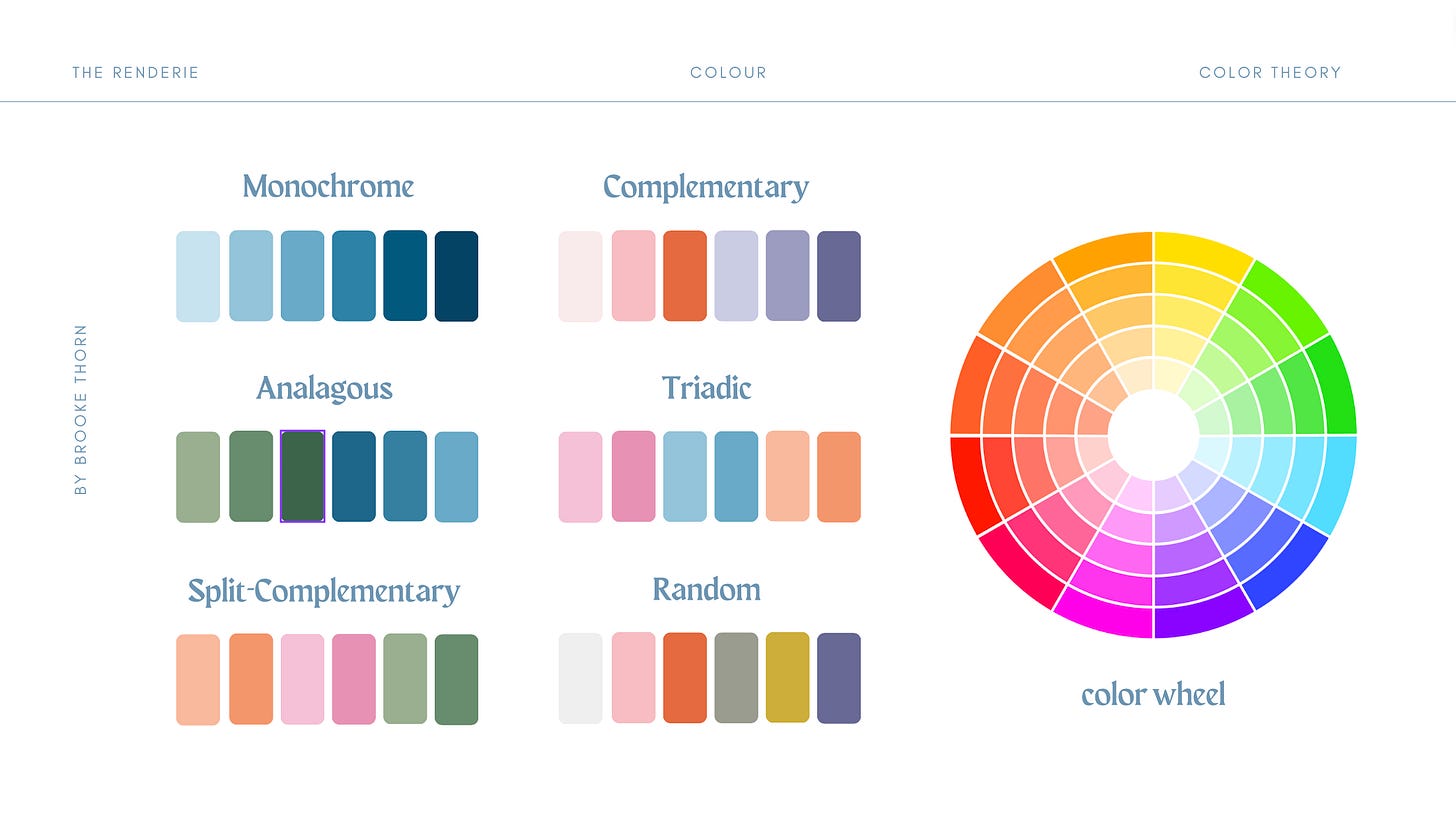
Monochromatic: A monochromatic color scheme uses a single base hue and varies its value (lightness or darkness) and saturation (intensity). This creates a cohesive and harmonious look.
Analogous: An analogous color scheme uses colors that are adjacent to each other on the color wheel. This creates a sense of harmony and balance, as the colors are closely related.
Complementary: A complementary color scheme uses colors that are opposite each other on the color wheel. This creates a high-contrast, vibrant look that can be visually striking.
Triadic: A triadic color scheme uses three colors that are evenly spaced on the color wheel, forming a triangle. This creates a balanced and dynamic look.
Split-Complementary: A split-complementary color scheme uses a base color and the two colors adjacent to its complement on the color wheel. This creates a more nuanced version of the complementary scheme.
Random: A random color scheme uses colors that are not necessarily related on the color wheel. While this can create an eclectic and unique look, it requires careful consideration to ensure visual harmony.
Tips for using color harmonization schemes:
Choose a dominant color and use the other colors in the scheme as accents to create visual interest.
Adjust the saturation and value of colors within a scheme to create depth and variety.
Consider the emotional associations and psychological effects of the colors you choose.
Use color harmonization schemes as a starting point, but don't be afraid to experiment! Most of my palettes are random but strengthened with harmonization considerations.
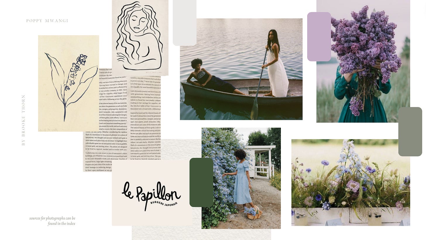
Working from a photo or mood board is a great starting point as it allows you to see the big picture (like below).
Creating The Perfect Palette:
Consider a combination of color theory, intuition, and experimentation. Here are some steps to guide you:
What are you using the palette for?
Consider the intention (e.g., branding, web design, interior design, art).
Determine the mood, emotion, or message you want to convey.
Choose a color scheme:
Monochromatic: Variations of a single hue.
Analogous: Colors that are adjacent on the color wheel.
Complementary: Colors that are opposite each other on the color wheel.
Triadic: Three colors evenly spaced on the color wheel.
Split-Complementary: A base color and the two colors adjacent to its complement.
Random
Select your base color:
Like planning a room around your favorite rug or painting, choose a primary color that aligns with your purpose and desired mood.
Add secondary colors:
Use your chosen color scheme to select additional colors that complement your base color.
Ensure that the secondary colors create a harmonious and balanced palette.
Adjust color proportions:
Decide on the relative amounts of each color in your palette.
A common approach is to use the 60-30-10 rule: 60% primary color, 30% secondary color, and 10% accent color.
Consider color temperature:
Balance warm colors (reds, oranges, yellows) with cool colors (blues, greens, purples).
Use color temperature to create depth, contrast, and visual intrigue.
Test your color palette:
Apply your color palette to a sample project or mockup.
Evaluate how the colors interact and whether they effectively convey your intended message.
Refine and adjust:
Make adjustments to your color palette based on your testing and feedback.
Experiment with different shades, tints, and tones of your chosen colors to find the perfect balance.
Create a color guide:
Document your final color palette, including hex codes or Pantone numbers.
Provide examples of how to use the colors effectively in your chosen medium.
Color Interaction:

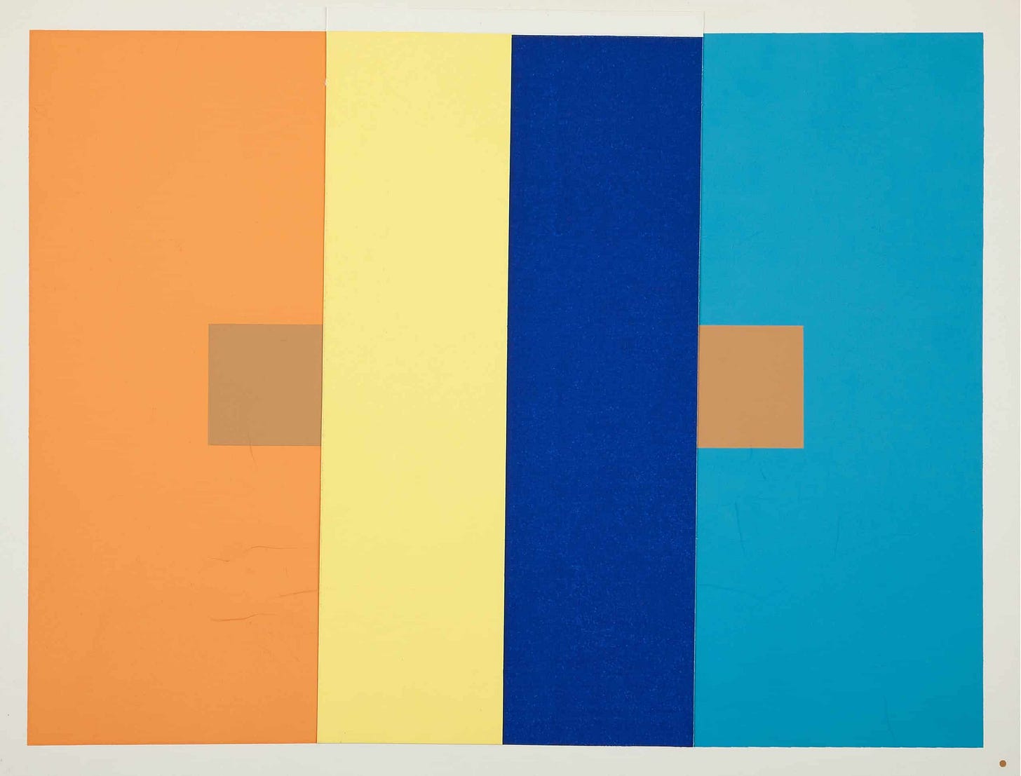
When I studied Color Theory in school, we focused on the work of Josef Albers and used Coloraid paper to experiment. Josef Albers was a renowned artist and educator who is best known for his extensive research and teachings on color theory. If you’ve been to the MoMa, you’ve seen his works! His book "Interaction of Color" (1963) is considered a seminal work on the subject. Albers believed that color is relative and that our perception of a color is influenced by the colors surrounding it. Here are some of the basic principles of color interaction as taught by Josef Albers:
Color Relativity: Colors are perceived differently depending on their surroundings. The same color can appear different when placed next to different colors.
Subtraction of Color: When a color is placed next to another color, it can appear to subtract or neutralize certain wavelengths of the neighboring color. This can make the adjacent color appear duller or less intense.
Simultaneous Contrast: This is the phenomenon where the perception of a color is influenced by the color next to it. For example, a gray square will appear lighter when placed on a black background, and darker when placed on a white background.
Reversed Grounds: This principle demonstrates how the perception of a color can change based on the color of the background. A light color will appear darker against a light background, while a dark color will appear lighter against a dark background.
Color Intensity: The intensity or saturation of a color can be altered by the colors surrounding it. A highly saturated color can make adjacent colors appear less saturated, and vice versa.
Color Illusion: Albers demonstrated that color perception can create optical illusions. He showed how colors can appear to vibrate, flicker, or create afterimages when placed in certain configurations.
Color Harmony: Albers explored various color combinations and how they can create harmonious or discordant visual experiences. He emphasized the importance of studying color relationships rather than individual colors in isolation.
Albers' approach to color theory was based on experiential learning. He encouraged his students to study color through hands-on experiments and observations, rather than relying solely on theoretical knowledge. His teachings emphasized the importance of understanding how colors interact with each other in order to create memorable visuals.
Troubleshooting a color palette:
Identify the issues:
Lack of harmony: The colors may clash or feel disconnected.
Imbalance: The palette may feel too warm, too cool, too light, or too dark.
Inappropriateness: The colors may not align with the intended message or brand identity.
Lack of versatility: The palette may not work well across different media or contexts.
Forgettable: The color combination may be too generic or lack distinctiveness.
Adjust the hue, saturation, and value:
Shift colors slightly on the color wheel to create a more harmonious relationship.
Adjust the saturation of colors to create a more balanced or muted palette.
Modify the value (lightness or darkness) of colors to improve contrast and legibility.
Consider what it evokes:
Ensure that the colors evoke the desired emotions and associations.
Simplify the palette:
Reduce the number of colors in the palette to create a more cohesive and memorable scheme.
Focus on using a dominant color and a few accent colors to create visual interest.
Test the palette:
Apply the color palette to various designs or mockups to see how it performs in different contexts.
Get feedback from others to gauge the effectiveness and appeal of the color combination.
Look for inspiration:
Study color palettes used by successful brands or designers in your industry.
Explore color palette generators or design resources for new ideas and inspiration.
Takeaways:
Limit your palette to 3-5 colors to maintain simplicity and clarity. Additional colors can be used to supplement or shine in photography.
Use online tools and resources, such as Adobe Color for inspiration and experimentation.
Study color palettes used by successful brands, designers, or artists in your field. But make them your own, don’t copy.
Trust your instincts and choose colors that resonate with you personally.
Be open to feedback and willing to make adjustments based on the responses you receive.
When in doubt, step away and come back.
Seek color in unexpected places, you never know what will inspire you!
Remember, creating the perfect color palette requires patience, good natural light, experimentation, and a willingness to learn from both nailing it and failing.
Sources on the topic:
A Field Guide to Color by Lisa Solomon
The Interaction of Color by Josef Albers
The Secret Lives of Color by Kassia St Clair
The Smithsonian’s The Science of Color
Helpful resources:
Coloraid.com for purchasing Albers approved colored paper
Did you learn anything or have anything else you’d like to contribute? Let me know in the comments!


I have no background in color theory and I am SO appreciative of this generous intro! Thank you 💛
Excellent resource Brooke,