

Art Lessons: The Fundamental Elements of Art
A deep dive on the basic elements of art and how artists use them to create a sense of style!


Whether flipping through a coffee table book or taking myself on an “artist date” to a museum, I am enamored by how various artists utilize the same seven principles of art… differently. I love standing at the edge of the painting, observing from a 90-degree angle. This practice allows us to see how they did it— to try to sort out how the artist layered their paint or manipulated these facets to create each piece or style. Did they use painstakingly applied layers of glazes? Did they toss the paint on the canvas? Did they pop balloons a la Princess Diaries? Consider this act an examination for inspiration.
Art is a powerful medium of expression and information. It has captivated humanity for thousands of years! Although the basics remain the same, from cave paintings and fertility sculptures to fan art and room-filling installations, technology, research, and practice have allowed humans to evolve and improve their applications.
Understanding the fundamental elements of art can significantly enhance either POV from the maker’s creation to the viewer’s appreciation of artistic works. My experience learning about art has changed my views of certain artists from “I don’t get it” to “Ohhhh, that’s quite rebellious and interesting!” Spoiler: Mondrian’s neo-plasticism.
Learning or refreshing one’s understanding can aid in how we talk about art or form our opinions. Sure, a sculpture may not speak to you, but can you provide a reason? Have you ever been put on the spot to talk about art but have stage fright when winging it? After reading this post, I hope you will take away some bite-sized tips for learning to talk about an artwork you’ve never seen before, but it sounds like you have a favorite art haunt. I will also share some tidbits of what I would say if I had to describe a piece.
In this post, we'll delve into seven key elements that form the building blocks of visual art. Within each element, we’ll explore its different categorizations, some applications to try or recognize, and then two quick examples of artists using these principles to define their style. These principles are line, shape, form, value, color, texture, and space.
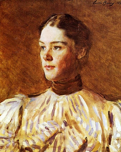
The brushstrokes in this painting are a testament to how the artist uses line in her work. Subtle, directional strokes in the background create movement, while the broad, spaced strokes in her blouse suggest form without providing much detail.
1. Line
Lines are the most essential element of art, yet their importance cannot be overstated. If the artist is a printmaker, paper artist, intaglio etcher, drawer, etc., chances are how they utilize lines are fingerprints in what makes their art theirs. I got into this a bit more in my previous mark-making lesson, which is linked below.
Thick lines, thin lines, curves, long, short, close together, far apart—the list continues. Similarly to our handwriting, how we render lines can convey a lot of emotion and share meaningful messages from our work. Furthermore, the combination of expressed lines is what can make typography choices so valuable, e.g., bubble letters vs. the robotic vibe of monotype.
Types of Lines:
Straight: Convey stability, order, and structure (think Ancient columns)
Curved: Suggest movement, grace, and fluidity (think waves or kelp fronds)
Thick: Imply strength and boldness
Thin: Indicate delicacy and precision
Continuous: Create a sense of flow and connection
Broken: Suggest uncertainty or rhythm, energy
Practical Applications:
Contour drawing: Using lines to define the edges of forms, like Picasso's drawings.
Hatching and cross-hatching: Creating texture and shading through closely spaced parallel or crossing lines, like the fine etching techniques found on currency or etching plates.
Gestural lines: Quick, expressive lines that capture the essence of movement or form, like in Manga, Anime, or Comic strips.
Examples in Art:


Vincent van Gogh's "Starry Night" uses short and long swirling, energetic lines to create a sense of movement in the sky. The direction of his lines helps sculpt the various subjects in the scene, like the rooves on houses, sweeping hillsides, and the celestial sky. Lastly, the two cypress trees are depicted through their upright strokes, similar to how the tree grows. Some art historians believe that this painting is a self-portrait of sorts and that the cypress trees, typically symbolizing death, were a nod to the loss of his brother. I’m sharing the paper on this here.
Piet Mondrian's geometric abstractions employ straight lines to create ordered, harmonious compositions. Boxes with black, white, and primary colors are in between the lines. His work was also a rebellion against the more “traditional” and “elite” art scene by pairing his work down to the most essential art principles. According to The Tate Museum in London, U.K., “Neo-plasticism was, in fact, an ideal art in which the basic elements of painting – colour, line form – were used only in their purest, most fundamental state: only primary colours and non-colours, only squares and rectangles, only straight and horizontal or vertical lines. Mondrian had a profound influence on subsequent art and is now seen as one of the greatest of all modern artists.” Growing up, I was fortunate to have parents who brought me to art museums, and both Rothko and Mondrian made me SO mad! Perhaps it was my budding criticism of the world as to why people paid millions of dollars for these works that brought up these feelings, but once I learned about the why behind the work, I loosened the reins of my grudges… a little bit.
Exercise: We covered mark-making in a previous post— feel free to revisit the post for a refresher and a guide to making your own expressive lines!
A little glimpse from a recent trip to NYC— I loved running around The Met, The MoMa, The New York Public Library, and The Natural History Museum for inspiration.
2. Shape
When we say “all shapes and sizes” for individual objects, these qualities can also make a difference in your art. Shapes are enclosed areas created by lines or color differences— they can be organic, like leaves, clouds, or whatever feels right at the moment, or geometric, like squares, triangles, trapezoids, etc. Shapes are the building blocks of composition and can be manipulated to create balance, contrast, and emphasis.
Types of Shapes:
Geometric: Regular shapes like circles, squares, and triangles
Organic: Irregular shapes found in nature like clouds, bushes, leaves
Positive: The main subjects or objects in a composition like a vase, a bike, a person
Negative: The spaces between and around positive shapes like the background, the wallpaper, the sky
Practical Applications:
Simplifying complex forms into basic shapes for more straightforward rendering— painters and other artists use this technique called blocking. One squints their eyes and discovers that a bird can be made from a series of ovals, teardrop shapes, and triangles for the basic structure.
Shape repetition is used to create patterns and rhythm. I like to do this in my needlepoint work!
Employing contrasting shapes to create visual interest
Examples in Art:


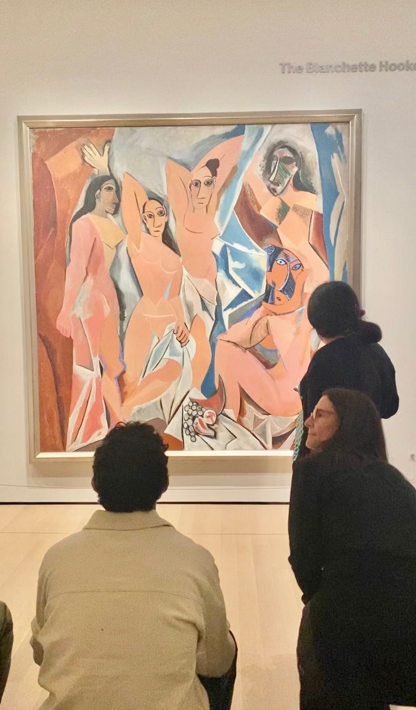
Pablo Picasso's Cubist works break down subjects into two-dimensional geometric shapes. This style was thought to break from a single-point perspective and to bring simultaneous planes and viewpoints to the forefront to create dynamic movement. While Picasso is one of the artists attributed to cubism (along with Georges Braque and Henri Matisse), it is important to note that these paintings were inspired by and, in some ways, appropriated Iberian and African art that already existed. I have included an image of Pablo Picasso’s Les Demoiselle De Avignon from 1907 above— it is part of the permanent collection of the MoMA in NYC. It is considered one of the “first” cubist paintings. For more about Cubism, I am including a link from The Tate.
Henri Matisse's cut-outs use vibrant paper cut in organic shapes to create colorful, expressive compositions. Although they were said to have been the planning process of large murals, the paper cutouts have their own place in art history and were determined to be artworks themselves that have over and over earned their own exhibitions. They are also a good depiction of the positive and negative use of shape and form (more on that next). One of the benefits of using this medium is that once you have determined the shapes of the pieces of the artwork, you can move them around, turn them at different angles, and have a very hands-on approach to art making before pasting them down. The image is from the MoMa’s exhibition of Henri Matisse’s cut-outs in 2015.
Exercise: Try your hand at cut-outs! Collect some magazine clippings, colored paper, a gluestick, and scissors, and create your Matisse-inspired cut-out work! This would be a great activity with friends and children or on a rainy Sunday for some alone time.
3. Form
Form refers to three-dimensional objects and the illusion of depth on a two-dimensional surface. Think still lifes, portraits, landscapes, you name it. Understanding form is crucial for creating realistic representations and sculpting—or choosing not to go the realistic route!
Aspects of Form:
Volume: The space occupied by a three-dimensional object. Sometimes, artists use the rule of thirds to balance the form in the composition—more on that in another post.
Mass: The visual weight of an object. Does it have a shadow directly attached, or is the object levitating and the shadow on the ground below? Does the object feel like it is floating despite us knowing an elephant is heavy? Is it sinking into the earth?
Depth: is the perceived distance from the viewer. Artists can use a technique called sfumato, a slight blurring of forms and colors, to create a distancing effect, like when rendering mountains in the background of a painting.
Techniques for Creating Form:
Shading and highlighting: Using gradations of light and dark to create the illusion of volume— one trick I learned from a painting/color theory professor is to mix your shadow with a complementary color of the object for harmony. For example, if you paint an orange, include a slight touch of ultramarine or purple in the shadow. Mix the base color with white for the highlights and work your way to white.
Perspective: Using techniques like linear perspective or single-point perspective to create depth. Each object exists in its specific spot in space, and how the angles change depends on where the artist or viewer is looking from. Single-point perspective was an innovation of The Renaissance Era.
Foreshortening: Adjusting proportions to represent objects extending toward or away from the viewer—trees and objects will get smaller and smaller in the background as they move away from the viewer and will get bigger and bigger as they move toward the viewer.
Examples in Art:


Michelangelo's sculpture "David" masterfully captures the human form in marble. However, when looking at it in La Academia, you will notice that his hands are * huge .* This is because he was intended to stand well above the audience on the facade of a building. As a result, Michelangelo di Lodovico Buonarroti Simoni (or Michelangelo for short) expertly crafted his proportions accordingly. Decisions were later made to have him on display in a museum, so for keen observers, you may notice that his hands seem a little off.
Rembrandt's portraits use chiaroscuro (strong contrasts between light and dark) to create a sense of form and depth. This effect can expertly make the viewer feel like they are in the candlelit room with the subjects. I’ve included The Metropolitan of Art’s Woman With A Pink by Rembrandt van Rijn, painted in the 1660s. The key to well-established chiaroscuro is a determined source of light. Some painters even choose to include a source like a candle, a lantern, or a small window.
4. Value
Value refers to the lightness or darkness of a color or tone, from pastel pinks to dark, chocolatey browns. It's essential for creating contrast, depth, and mood in artwork.
Key Concepts:
Tints: Colors mixed with white or tinted pigments to increase lightness
Shades: Colors mixed with black or dark pigments to increase darkness
Tonal range: The spectrum from the lightest to the darkest values in a work, also known as contrast in regards to light.
Techniques:
Value scales: Creating gradients from light to dark to understand and control value
Chiaroscuro: (We just learned about this!) Using strong contrasts between light and dark for dramatic effect
High-key and low-key compositions: Artworks that predominantly use light or dark values


Examples in Art:
Anna Bilińska-Bohdanowicz deftly employs contrast, color theory, and brush strokes in her paintings for dramatic effect. This Ukrainian painter is one of my favorites for her portraiture. In this portrait of Anna Bilińska-Bohdanowicz by Emmeline Deane, titled Anna Bilinska (1857–1893), There is a softness, with the pale mauve backdrop offsetting the mourning dress of the subject. While there is a strong contrast between the background and the woman, the garments hold very little contrast, adding a weightiness to them.
J.M.W. Turner's landscapes, like Fishermen At Sea, are known for their subtle value shifts to create atmospheric effects. Notice the contrast between the dark, ominous seas and the light captured in the waves— it’s truly magical! [Sketch, where’s the final painting story]
5. Color
Color is one of the most impactful elements in art. It can evoke strong emotions (science proves this) and create visual harmony… or chaos/discord. I have two color theory and psychology lessons if you’d like to dig in further!
Color Properties:
Hue: The pure color itself (e.g., red, blue, yellow)
Value: The lightness or darkness of a color (tint or shade)
Intensity (Saturation): The purity or strength of a color
Color Theory:
Primary colors: Red, blue, and yellow
Secondary colors: Green, purple, and orange (created by mixing primary colors)
Tertiary colors: Colors created by mixing a primary and an adjacent secondary color
Complementary colors: Colors opposite each other on the color wheel (e.g., red and green)
Analogous colors: Colors adjacent to each other on the color wheel
Practical Applications:
Color harmony: Creating pleasing combinations using color theory
Color symbolism: Using colors to convey emotions or ideas
Optical color mixing: Placing pure colors side by side to create the illusion of a mixed color when viewed from a distance


Examples in Art:
Claude Monet's use of color was central to his artistic vision, emphasizing the transient effects of light and atmosphere. This can be grasped from his water scenes, sunsets, landscapes, and beyond. His use of color also changed as he aged, and his cataracts altered his perceptions of reality and pigment. He often applied pure, unmixed pigments directly onto the canvas, which relied on optical mixing—where colors blend in the viewer's eye rather than on the palette. This approach was simply luminous. He’s a favorite for a reason. While painting landscapes, often the light changes while you’re painting. A scene you’re trying to render in the morning will look different at dusk. Impressionism allows for the multitudes of a scene, capturing various moments of light.
In his water lily series, Monet layered greens, blues, and violets for depth, contrasting with highlights of pink and white to depict shimmering reflections. This use of optical mixing made his work a cornerstone of Impressionism, redefining how color is perceived in art. But like all new movements, it wasn’t welcomed with open arms at first!
Mark Rothko's Color Field paintings profoundly explored emotion and spirituality. Do you know how the color blue can make you feel calm while red signals alert (in the Western World)? Known for his large-scale Color Field paintings, Rothko layered hues of color to create soft, floating rectangles that are more expressive than rigid. I know, they made me mad as a child—but how powerful is that!
His palette ranged from vibrant oranges and yellows to somber burgundies and blacks, reflecting shifts in mood and intention. Rothko’s use of color was not merely aesthetic but deeply symbolic, aiming to evoke universal human feelings like joy, despair, etc. In a previous art lesson, we talked about color interaction and psychology. By blending and juxtaposing colors with subtle variations, he created an immersive experience, inviting viewers to connect emotionally and spiritually with his work. Or maybe you don’t resonate and keep walking!
6. Texture
Texture adds depth and interest to artworks by appealing to the sense of touch, even in two-dimensional pieces.
Types of Texture:
Actual texture: The physical surface quality of an artwork
Visual texture: The illusion of texture created through artistic techniques
Techniques for Creating Texture:
Impasto: Thick application of paint to create a raised surface
Collage: Incorporating various materials to create textural contrast
Sgraffito: Scratching through a layer of paint to reveal underlayers


Examples in Art:
Cecilia Beaux, an American portrait artist, masterfully used texture to bring depth and vitality to her works. She became one of my favorites while writing this lesson! Her brushwork was dynamic and varied, blending fine detail with expressive strokes to capture her subjects' physical and emotional presence. As someone who loves abstract and detail, I find her work a treat. Beaux’s textures often emphasized the interplay between light and fabric, hair, or skin, creating a tactile quality that made her portraits strikingly lifelike despite the lack of fine detail and opacity. For example, in Sita and Sarita (above), the contrast between the shimmering satin of the woman’s dress and the cat's soft fur reveals her skill in depicting diverse surfaces.
Beaux also used texture to enhance the mood and personality of her compositions. In her portraits, smooth, polished areas often held their own against looser, more painterly sections. This technique directs the viewer’s attention while suggesting movement. This approach set her apart from contemporaries, earning her comparisons to John Singer Sargent. Through experiments with texture, Beaux’s work continues to captivate audiences.
If you have ever been to Barcelona, Spain, you may have stumbled upon a Gaudí! Antoni Gaudí, the Catalan architect, revolutionized texture in architectural design, incorporating intricate, tactile surfaces to create spaces that feel alive and lovingly resembling Candy Land. Gaudí’s organic approach drew inspiration from nature, seen in the textured facades and interiors of his iconic works like Casa Batlló and La Sagrada Família. He employed various materials—stone, ceramic, glass, and iron—to craft undulating, mosaic-covered surfaces that shimmer with color and light.
Gaudí’s use of texture went beyond just being a marvel to look at. They served functional and symbolic purposes, too. By reimagining texture as a fundamental element of architecture, Gaudí broke away from rigid, conventional forms, transforming his structures into immersive, multi-sensory masterpieces that continue to inspire architects and designers worldwide today.
7. Space
Space in art refers to the area within, around, between, and behind objects in a work. It's crucial for creating depth, balance, and emphasis. This can be within a 2-dimensional piece like M.C. Escher or a sculptural piece like Giacometti. For this example, I have two incredible artists featured for you, Simone Leigh and Jukhee Kwon. I was lucky enough to install a body of Kwon’s work in 2013.
Types of Space:
Positive space: Areas occupied by the main subjects or objects
Negative space: The empty areas around and between the main subjects
Realspace: The actual three-dimensional space occupied by sculptures or installations
Illusory space: The perception of depth created in two-dimensional works
Techniques for Manipulating Space:
Perspective: Using linear or atmospheric perspective to create depth
Overlapping: Placing objects in front of each other to suggest spatial relationships
Scale: Varying the size of objects to indicate distance


Examples in Art:
Simone Leigh’s captivating sculptural work takes up space in many facets. Her art centers Black women's histories, experiences, and resilience with monumental forms, often inspired by African and African diasporic traditions, like her Sentinel (Mami Wata—a West African water spirit akin to mermaids or sirens, yet different.) They command physical and symbolic space, asserting presence and identity. For instance, in Brick House (above), a 16-foot-tall bronze sculpture of a woman with a dome-like torso, the figure becomes an anchor within its environment, conjuring connection, curiosity, and attention. Leigh’s use of space emphasizes power and protection, creating environments where marginalized histories are honored and reclaimed. It’s long overdue for these voices and stories to materialize in the same monumental manner as many oppressors have been, but Leigh has communicated that she doesn’t desire the responsibility of replacing one for another— they are to shine in their own right; their own light.
Leigh’s works often transform their spaces into reflection and collective memory sites. Whether in galleries or public spaces, her sculptures create dialogues between form and surrounding architecture, challenging the viewer to reconsider the cultural and historical implications of space itself. By occupying space unapologetically, Leigh redefines it as a realm of empowerment and resistance.
Jukhee Kwon is a South Korean artist who crafts enchanting installations that transform space through a meticulous interplay of material and movement. She explores rebirth cycles through the duality of destruction and recreation through abandoned books. Using discarded books, Kwon transforms the objects into cascading sculptures that evoke waterfalls, trees, or organic growth. Her concepts are limitless, and she uses different folding techniques, weaving, beading, and beyond while staying true to the source materials. They are as magical as they are delicate in real life, and due to her cutting technique of slicing between the lines, one can still read lines of works like War & Peace and other books of her choosing.
Above, I have selected the Oval Book Forum to share with you—a sculptural installation of several books depicting a waterfall-like succession of Roman columns. The shredded pages spill downward, expanding into their surroundings and blurring the line between the artwork and the space it occupies.
Kwon’s art engages space as an active participant in the viewer’s experience. Her installations often respond to the architecture of their setting, with tendrils of paper flowing across floors, walls, or ceilings. This interaction invites viewers to navigate her works, emphasizing the fluidity of space and the transformation of static objects into dynamic, spatial narratives. By deconstructing books, Kwon reclaims space as a site of creativity and rebirth, turning remnants of the past into living, immersive environments. It is truly amazing how expansive these pieces can be from the simple pages of the books they sprawl from.
By embracing these fundamental principles, artists can create eye-catching works that convey deep emotions and complex ideas. Understanding these elements will enrich your art appreciation, creation, and collection, whether you're an aspiring artist, museum wanderer, or antique collector. Remember, while these principles provide a foundation, how you wield them and make your marks makes your work distinctly yours!
Exercise:
Wander around a gallery, a statue garden, or online and pick out five art pieces. Grab a pen and paper or your favorite writing app and experiment with describing them using the elements of art. How does the artist play with light? Color? Texture? What does it remind you of? How does it make you feel beyond “I love it” or “Thanks, I hate it.” Sometimes, paying attention to museum plaques or picking up an art history book from your local library can help you better learn how to talk about art—but I like to read them *after* I look at the art.
Example:
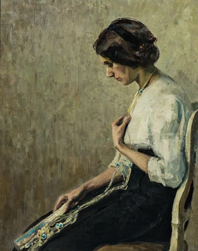
This painting captured my attention immediately. I even felt compelled to say, “Okay, Cecilia Beaux may be my favorite impressionist.” The muted, earthy colors with touches of turquoise were an initial pull. The strong and subtle contrasts create a melancholy mood, enhanced by the subject's downward gaze and how she touches her pendant? It's as if she's seeking comfort or reassurance. What must she be going through?
I'm struck by the expressive, sculptural brushwork that adds texture and emotion to the piece. In contrast to paint application by Dutch Masters, the artist skillfully captures the subject's features, especially the hollowness of her cheeks, with minimal detail. Yet the expression of paint application says so much! Her pose and body language raise questions about her thoughts or feelings.
I particularly appreciate the bright, glinting highlights of the turquoise in her jewelry and the shadows near her left elbow on the chair. The way the artist built up layers of color to create depth and form is compelling - a technique I always find appealing. Added colors in her blouse, hair, and shadow create a sense of wonder that has me roving my eyes around the canvas to look for more hidden strokes of unexpected color. The lack of white and liberal use of umber tones contributes to sadness, grief, and hopelessness.
This piece has made me want to explore Cecilia Beaux's work more. I am drawn to her style when exploring artists.
In our next lesson, I will discuss design principles like composition! This painting, in particular, is a masterclass in the rule of thirds!
Stay tuned,
Brooke
This is a gift! Thank you for taking us to school. Very excited for my next museum visit 💜
This is a concise yet detailed post. I especially liked that you gave practical applications and examples. Your comments gave it personal touch. Thank you so much for writing. I will look at your archives.