

Changing Colors In Your Needlepoint Project
When stitching over a painted canvas, you may choose to work in a thread color that’s different from what’s painted beneath.

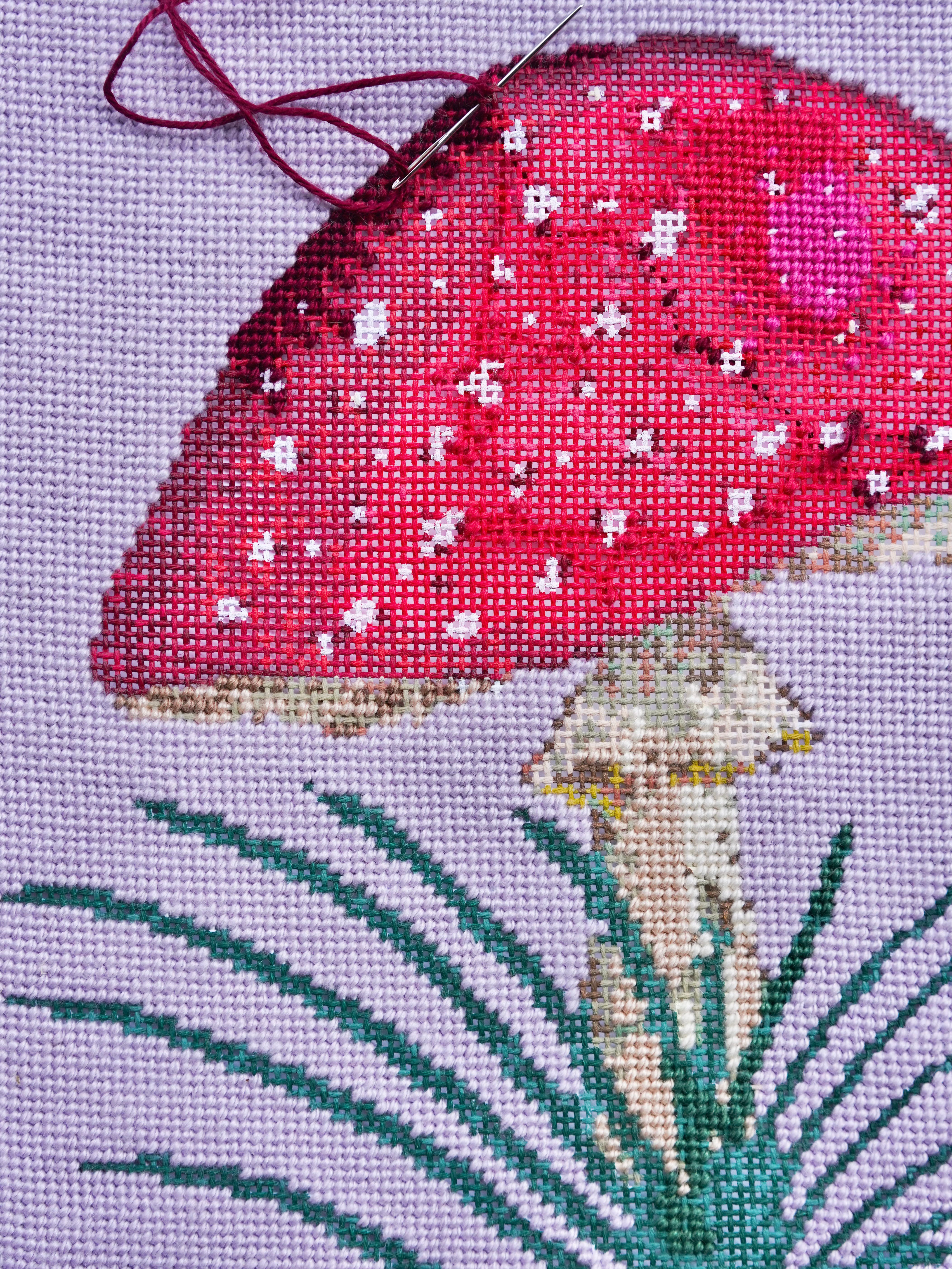
When stitching over a painted canvas, you may choose to work in a thread color that’s different from what’s painted beneath. I do this all the time, even with my own designs! For example, my fly agaric canvas above comes with a white background, but I chose Silk & Ivory’s Amethyst instead.
Maybe you’ve changed your mind about a color, or you’re altering the design to match your taste or a specific room’s palette. I’m team picky! Creating choices that differ from the designer’s palette is a fun way to make the project your own or add to its durability in use, and I love seeing how stitchers interpret the same design differently.
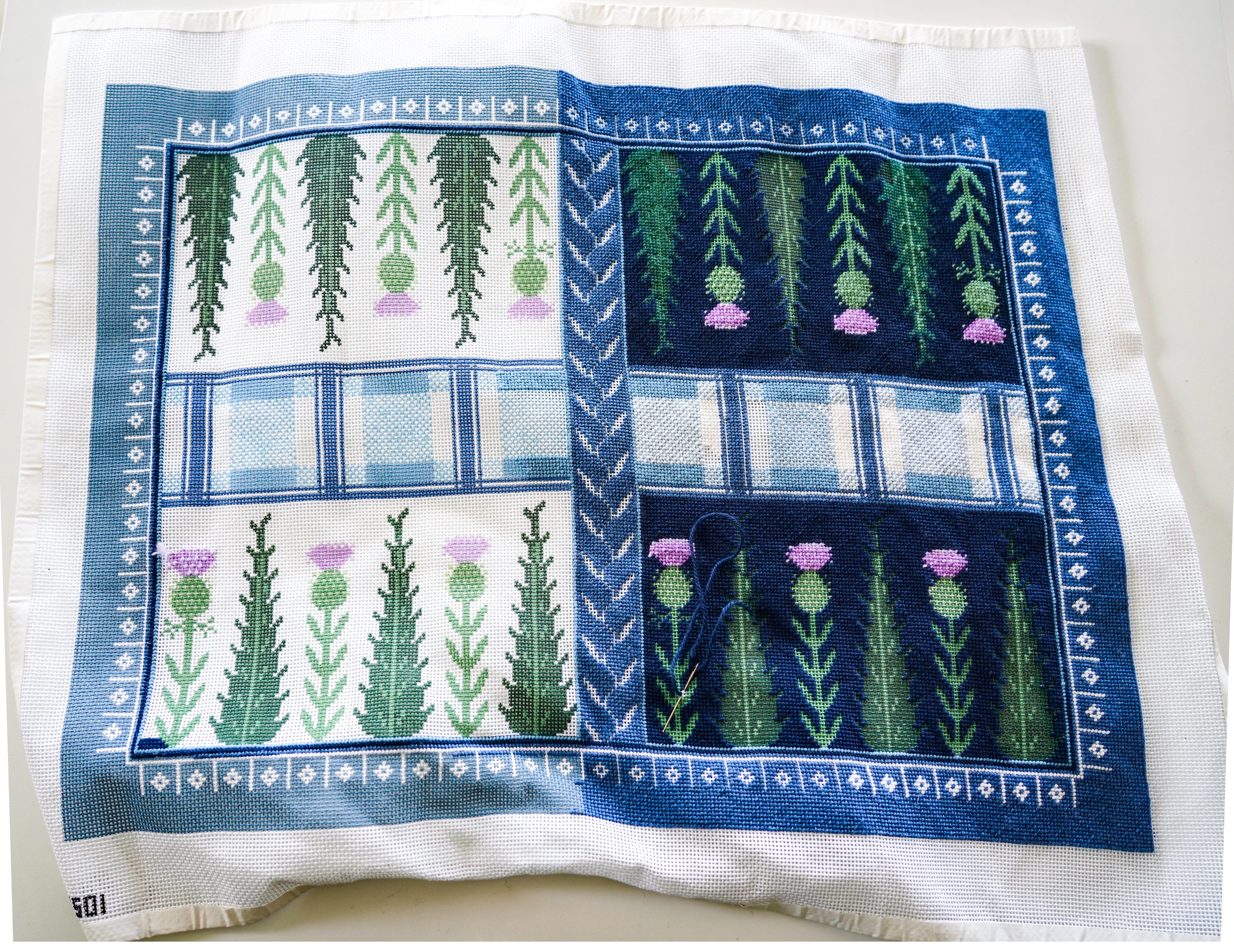
Thörn Alexander Thistle Backgammon Board
For my backgammon board, I decided to stitch with navy to make the thistles pop, and for its intended use—a roll up game board.
The Challenge of Coverage
While I’ve successfully stitched navy on white with even tension (like above), it doesn’t always work out. The painted canvas beneath your stitches can show through in unexpected ways, and the degree to which this happens depends on several factors: the thread's fiber content and thickness, your stitch tension, the stitch you're using, and most importantly, the relationship between your chosen thread color and the painted ground (artist’s speak for background color or the color the canvas was painted before adding the composition).


Woodland Home in Spring Canvas by Abigail Cecile
If the canvas is painted red and you want to stitch it in a different hue, staying within a related color family, like moving from red to coral, burgundy, or even a warm pink, will minimize how much the painted ground shows through and compete with your stitching.
While I broke that rule here, I chose a complementary color, and actually really loved the little specs of red that shone through. It reminded me of a medieval technique called bole that we’ll talk about in a bit.


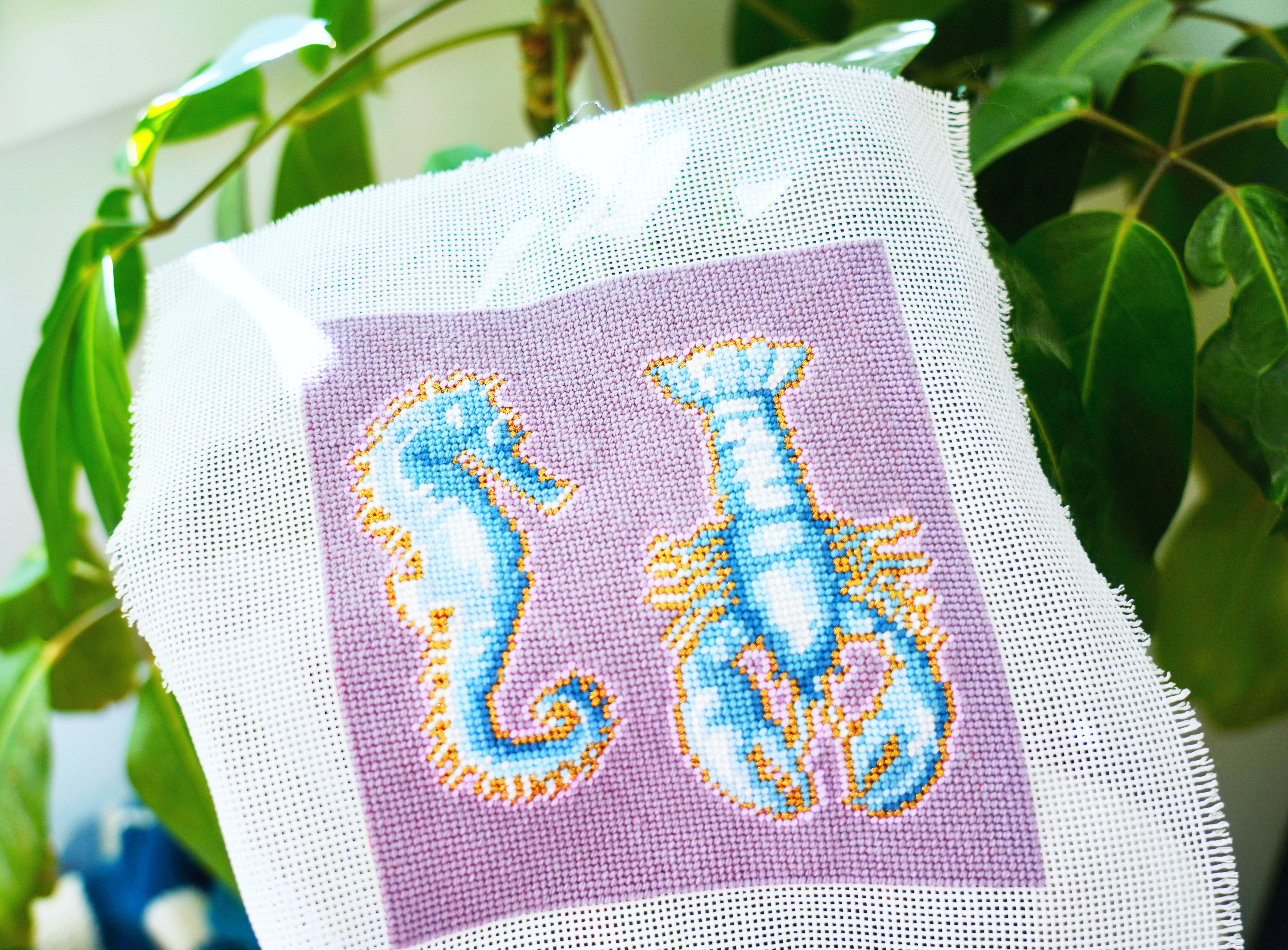
Seahorse & Lobster Eyeglasses Case by Ramsay Gourd at Lycette
Mind your value when making bold shifts.
If you need to make a dramatic color change—say, stitching blue over a red-painted canvas—choosing a thread with similar value (lightness or darkness) to the painted ground will help minimize show-through. A deep navy over a deep red will cover more seamlessly than a pale sky blue, which may require additional coverage or a denser thread to fully conceal the underpainting.
This principle applies across the board: dark over dark hides better than light over dark, and light over light works better than dark over light. However, if you’re going to pick between the two, dark over light works best, in my opinion.
When you're working against the grain—pale threads over dark canvas, for instance—consider using a thicker thread, adding an extra ply, or employing a denser stitch like basketweave or a textured stitch that provides fuller coverage.
Strategic Techniques for Challenging Color Changes
When you’re committed to a color choice that diverges significantly from the canvas, there are practical approaches to improve coverage:
Adjust your thread choice. Matte threads like wool tend to provide better coverage than shiny silks or rayons, which can sometimes be more transparent depending on weight or fiber content. If you’re set on a particular color family but struggling with coverage, experiment with different fiber contents. Tilli Tomas’s Wool is thicker for 13 and provides great coverage.
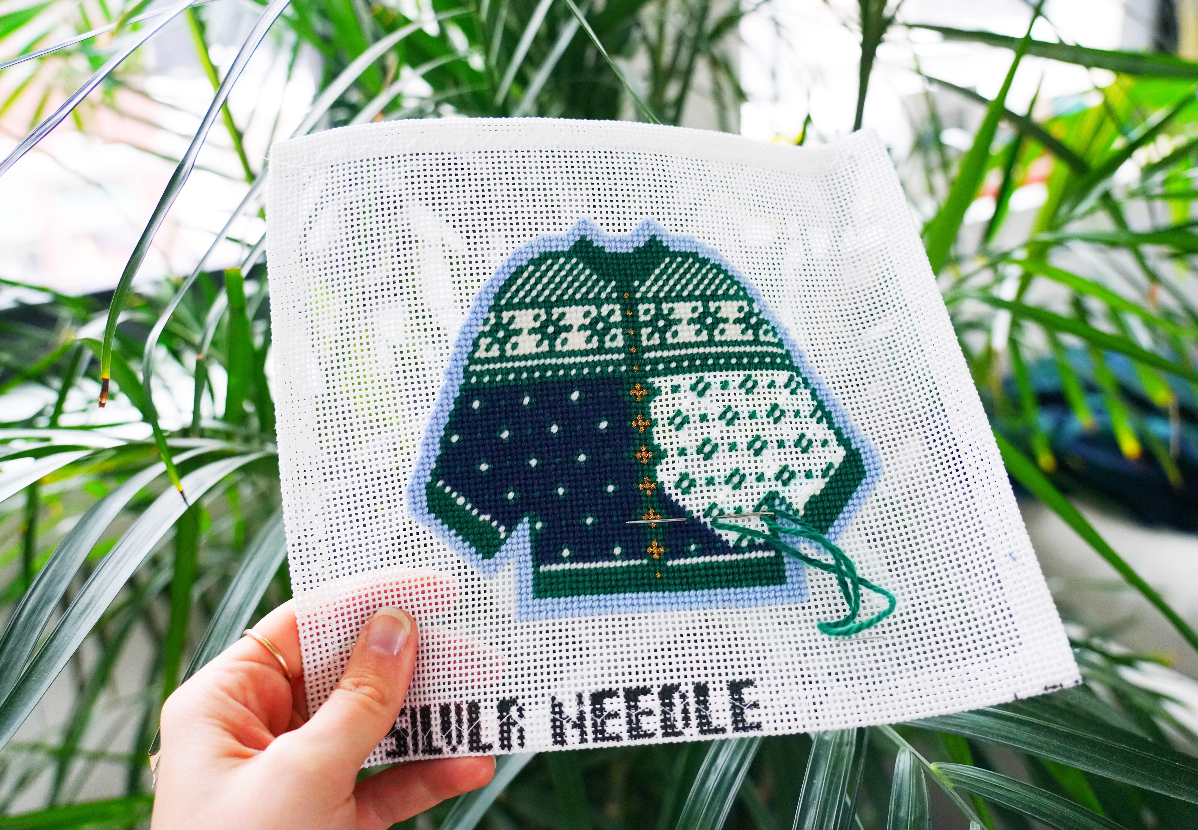
I stitched this cutie little cardigan for my grandmother who always has the best color work cardigans.
Consider tension. Maintaining a good tension can help. Experiment with how the threads lay when stitched. Be careful not to pull too tight, the paint may show through and you don’t want to distort the canvas. But mindful tension makes a difference.
Consider your stitch. Some stitches naturally provide better coverage than others. Basketweave, for instance, creates a denser fabric on the back that can help block show-through, while some decorative stitches leave more canvas exposed between passes.
When in doubt, paint over the background. We use acrylic paints.
Embrace What Shows Through
That said, not every bit of painted canvas needs to be completely hidden. Sometimes what peeks through between stitches becomes part of the work’s character, adding an unexpected twist to the finished piece. A little dappling if you will.
Art history detour! 🔔
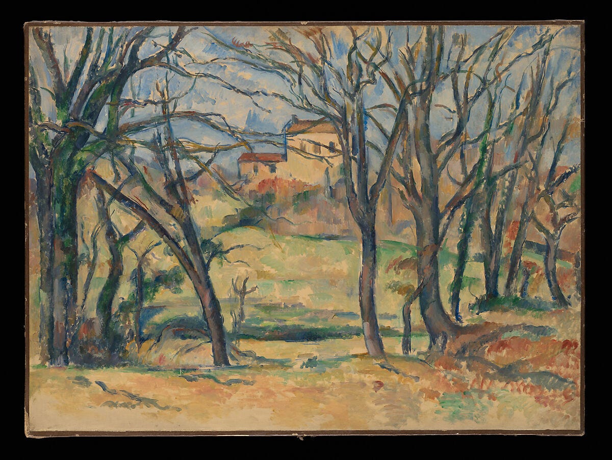
Trees and Houses Near the Jas de Bouffan, Paul Cézanne French, 1885–86.
Think of Cézanne’s paintings, where the underpaintings and grounds shine through and are a signature of his work. Those visible brushstrokes and patches of raw canvas or his under-paintings weren’t mistakes. They were integral to the vitality and immediacy of his compositions. In fact, we were taught to emulate this during a still life exercises in a few oil painting classes in university.
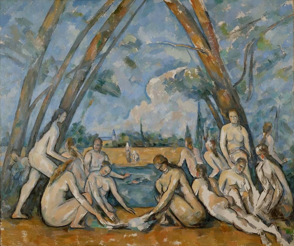
The Large Bathers, Paul Cezanne, 1898-1905
Paul Cézanne utilized exposed areas of the canvas ground as a deliberate technique in several paintings, notably Trees and Houses Near the Jas de Bouffan (ca. 1885-86) and in The Large Bathers, 1898-1905, above. This technique allowed the exposed ground color (a yellowish or brownish-tan ochre in Trees… and a grayish beige in Bathers…) to function as part of the composition’s color and light structure. It also helps his work be recognizably his!
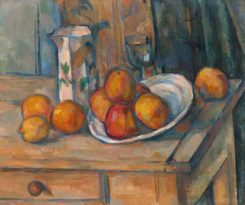
Still Life with Milk Jug and Fruit, Paul Cézanne, c.1900
In his still lives, he often used ultramarine blue to paint the under-paintings which contrasted beautifully with the warm citrus.
This method was part of Cézanne’s broader exploration of form and color, where he used warm colors to bring elements forward and cool colors to make them recede, a technique known as simultaneous contrast. The under-painting plays a role in the “constructive” brushwork (like sculpting with his brush strokes) that characterized his later, more modern style, which sought to create a sense of solidity and depth without relying solely on traditional linear perspective.
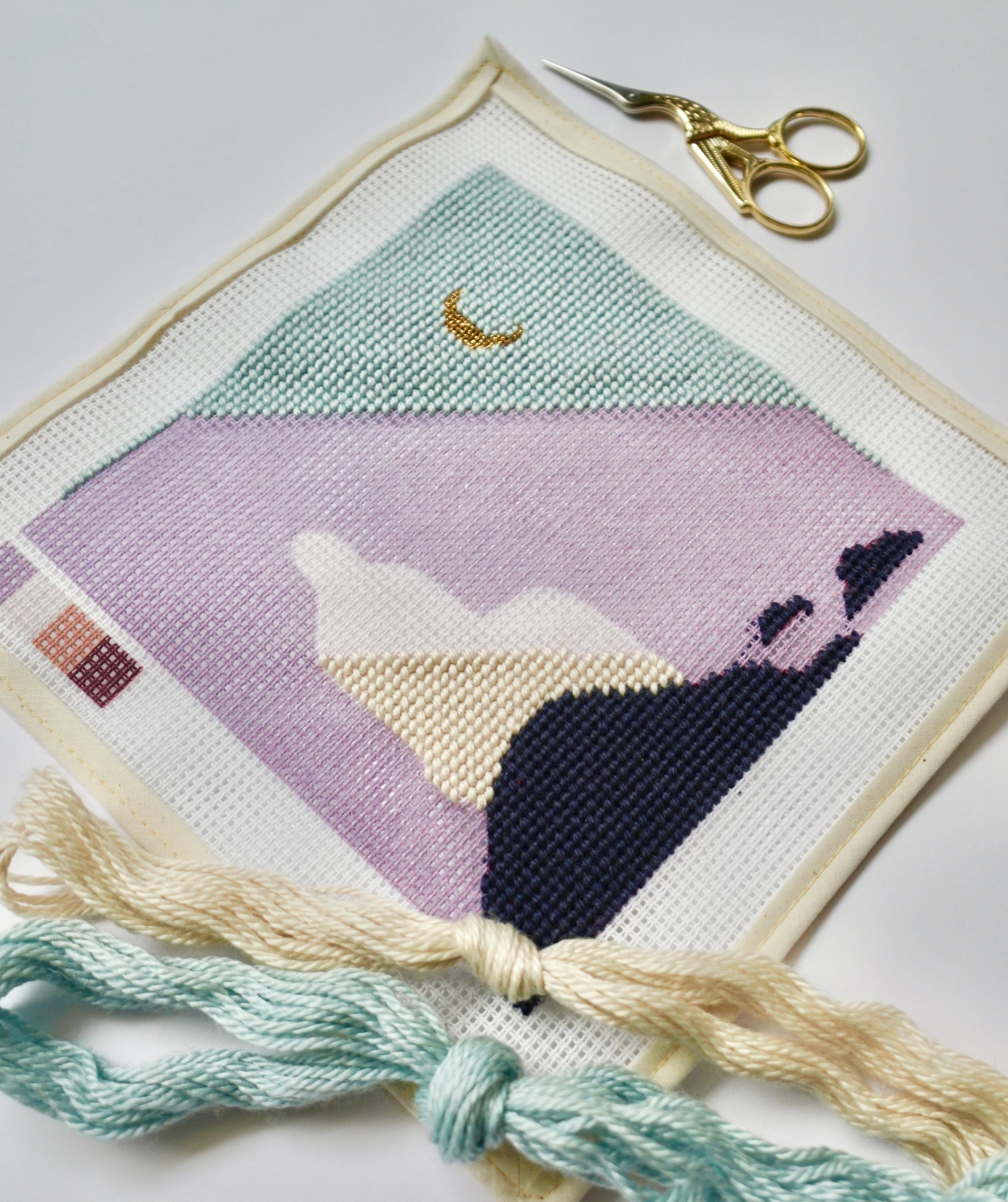
Or, like my aquatic project above, consider medieval illuminated manuscripts, where red bole (a type of clay) glows warmly beneath burnished gold leaf, creating a je ne sais quoi quality that comes specifically from that layering.
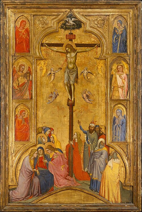
Crucifixion by Orcagna, c. 1365
Illuminations with red paint under a gold leaf ground use the red as a warm, traditional base (like red oxide or bole, a type of clay) to make the golden glow more ethereal and authentically, enhancing luminosity and depth, a technique found in manuscripts and modern art to create warm highlights, cover imperfections, and give a classic, antique feel, with red tones showing through the translucent gold for a warmer, deeper hue than yellow or white bases.
Wait, this is making want to stitch gold thread over a red background…
Back to Needlepoint:
In needlepoint, allowing hints of the original painted color to show, whether by design or happenstance, can add dimension, vibrancy, and a sense of layered history to the finished piece. A warm undertone peeking through a cool stitch can create an optical mixing effect that’s more interesting than flat, complete coverage. It can suggest age, patina, or simply the hand of the stitcher in collaboration with the designer.
When to Let It Live
When should you embrace the show-through, and when should you fight it?
There’s no universal answer, but here are some things to noodle on:
Does it add or detract? If the bits of painted canvas showing through create visual interest or subtle color variation, they’re working for you. If they create a splotchy, unfinished appearance that troubles your eye, they’re working against you. A professor once told me that the eye often first glances at things that are light, white, or bright. Is the white canvas poking through distracting or look unfinished?
Is it consistent? A little show-through throughout can feel intentional; random patches in only some areas typically read as uneven execution rather than artistic choice.
Does it serve your vision? Ultimately, you’re the one living with this piece. If the interplay between painted canvas and thread delights you, let it be. If it nags at you every time you look at it, it’s worth the extra effort to achieve better coverage. I’m a big frogger. 🐸
What’s the viewing distance? Pieces meant to be seen up close might benefit from crisp, complete coverage, while those displayed from across a room can carry more show-through without it being noticeable.
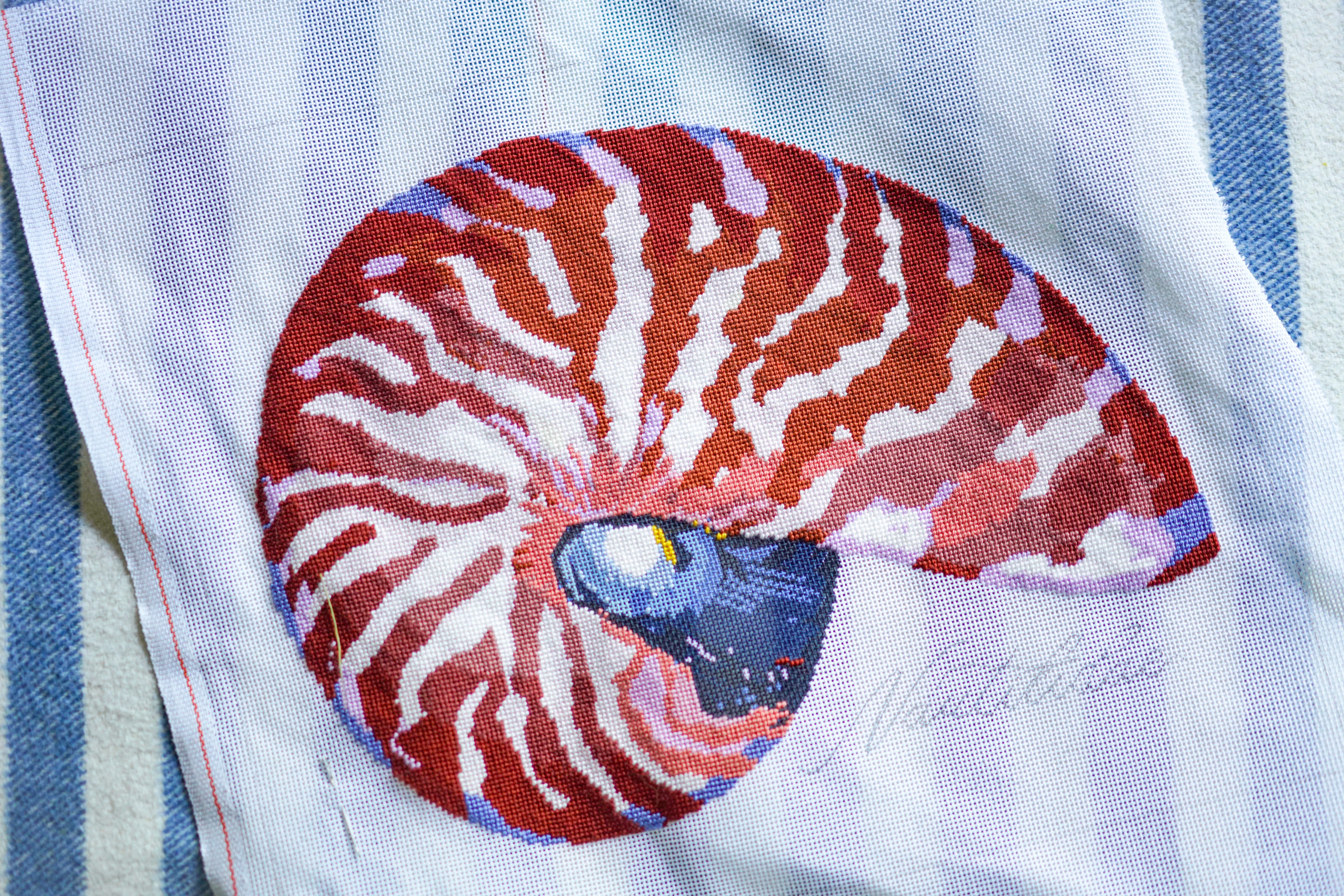
Thörn Alexander Nautilus Canvas
The Freedom to Interpret
One of the great joys of needlepoint is that moment when you hold a thread up to the canvas and think, “What if?” You know that feeling. You’re holding your canvas against the thread wall at your LNS and squint your eyes. What if this background were sage instead of cream? What if this flower were peachy-pink instead of coral? What if the whole palette shifted cooler, or warmer, or more jewel-toned? That’s play!
These “what ifs” are how we make a painted canvas truly ours. The designer has given you a map, but you’re the one taking the journey. Whether you follow it precisely or veer off into your own color story, the path is yours to choose.
If it serves the work, and makes you happy, let it live.
xo,
Brooke
Did you like this post?
This topic is an expanded version from a segment in my new stitch guide!
This is a 78-page love letter to play, experimentation, the power of repetition, and the meditation in the making. We discuss color theory, personalizing your projects, and explore 16 micro-art history essays on contemporary artists around the world. $33 USD.
Thank you so much for this! I really appreciated the mini art history lesson and connecting it to modern needlepoint.